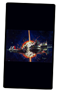
Final Zone II Wallpaper…
NOTE: Please enjoy the lyrics and music of Final Zone II, too.
Only a handful of folks are interested in Final Zone II (TurboGrafx-CD) these days, and, quite honestly, it is debatable if any of them would want to adorn their electronic devices with Final Zone II themed wallpaper.
If designing one wallpaper was a dubious proposition, then creating four different designs was imbecilic. But I did it, anyway. Enjoy, comrades.
A BRIEF HISTORY OF THIS PAGE: This page is a regurgitation of an ancient Final Zone II Preservation Project from many, many years ago.
Back then, only one wallpaper design was available: (1) a modified version of the North Amercian coverart…
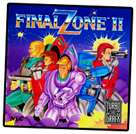
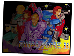
ORIGINAL vs. WALLPAPER: Can you find at least ten differences between the two? 10 points awarded for each correct answer. This was the first TG-16/PCE wallpaper I ever made. The version pictured here is "fade-to-black" with "big logo" …other variants featured a "small logo" with/without fading.
Two additional designs were completed but never available at the Final Zone II Preservation Project: (2) the "Torigawa" space station, and (3) Hanna Franks in front of the space station…
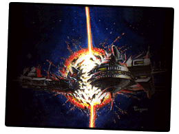
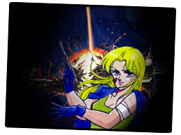
UNRELEASED: I feel that these two designs have aged better than the first. Over the years, they have adorned my laptop, but not much else. Explanation below.
BURNED: Unfortunately, my computer melted/imploded before I had a chance to upload these last two designs to the old Final Zone II Preservation Project. I did not have a backup of my work. Perhaps this was an act of God. Perhaps I was being punished for my unhealthy obsession with Final Zone II. I lost all of the source files (trashed harddrive) and had no desire to redo all the work. You really should backup your work.
REKINDLED: Needless to say, losing all my work left a bitter taste in my mouth. I did not think I would ever revisit this old stuff. Well, I was mistaken. Time sweetened the bitter aftertaste. It was a lot of fun to revisit this crusty, old project and create some (slightly) new things. I learned a few things, too, over the past decade. I learned that I haven't changed much. For example, I still have an unhealthy fixation with Final Zone II. I just pray the gods smile upon my endeavors now.
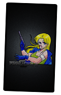
"Hanna Franks" Wallpaper… ▲
QUESTION: "So, why did you choose Hanna Franks?" ANSWER: I didn't have much choice. The instruction manual included illustrations for only two characters—Bowie and Franks. Of the two, the art for Franks is far more captivating. Bowie is frozen in one-dimensionality: his posture, eyes, and snarling lips appear fixated on one thing…we get a glimpse at his heart and mind—and there really isn't much going on. We quickly lose interest in him. Franks, in contrast, is much harder to discern. She is simultaneously fierce, deadly and calm. Normally, I reserve that set of adjectives for a sociopath. But here, in this context, it makes her a badass.
SOURCE MATERIAL: As you can see, the character art for Hanna Franks occupies only the corner of a page. Still, the Japanese instruction manual is in full-color, replete with screenshots and artwork. The North American manual, in contrast, was printed in black-and-white and did not include the illustrations of Hanna or Bowie.
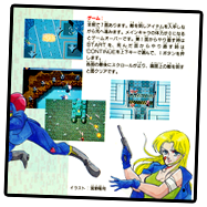

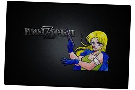
OLD vs. NEW: I liked the old design, but I thought that the background (space station exploding) was too busy and cluttered. So, after more than I decade, I was compelled to make another wallpaper featuring Hanna Franks.
LESS CLUTTER: For the new wallpaper, I wanted to keep it bold and basic. I wanted to strip away distracting clutter. The focus had to be on Hanna Franks, so a dull, gray spotlight replaced the exploding space station. In vain, I tried to incorporate the colorful Final Zone II logo into the new composition, but it didn't work. At all. (It diffused the focus on Franks.) Later, I realized that the bare-bones Final Zone II logo adorning the CD•ROM itself was exactly what I needed. And it had just been sitting there, staring at me in the face, the entire time.
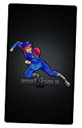
"Haward Bowie" Wallpaper… ▲
Although "Haward" was probably a typographic error, it doesn't matter because he is always referred to as "Bowie" (his surname) in the cinemas, anyway. That said, "Haward" is far more intriquing, as a name, than the lackluster "Howard". "Haward" = a badass. "Howard" = a duck.
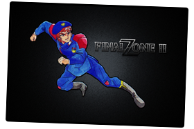
SOURCE MATERIAL: The illustration for Bowie spanned two pages of the original Japanese instruction manual. This means that I had to stitch together both halves of Bowie's character…if you look closely, you might be able to find the seam where the two images are joined.
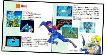
CHARACTER ART: Bowie leaps across two pages of the manual.
NEW APPRECIATION: Years ago, I did not use the character art for Bowie because it did not strike me as particularly impressive. Quite the opposite—I thought he looked goofy. Now, my heart has softened. I actually like Bowie's "power slide"...or is it a flying jumpkick? It doesn't matter. I like it now.
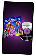
"TurboGrafx-CD" (Metallic Purple) Wallpaper… ▲
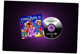
I love physical media, even when its aesthetics are basic and utilitarian. The North American instruction manual (black & white, with few illustrations) was not as impressive as its Japanese counterpart (printed in full-color, with many illustrations & screenshots). Still, the TurboGrafx-CD manual and disc possessed an aesthetic charm of its own. It is celebrated below.
LET'S NOT BEAT A DEAD HORSE: The amateurish quality of the coverart has been the object of much ridicule. I have no barbs or insults to add to what others have already said, and, honestly I cannot say much in its defense.
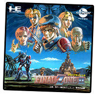

JAPAN vs. NORTH AMERICA: Original PC-Engine coverart is a veritable masterpiece compared to the artwork accompanying the TurboGrafx-CD version.
SUCH IS THE GLORY: I will admit that I cherish this art, but for all the wrong reasons. It is a naive and utterly inept interpretation of the source material. That said, I find it far more charming and pleasurable (for all the wrong reasons) than, say, the North American coverart for Capcom's MegaMan (NES).
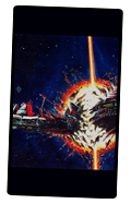
"Torigawa" (Space Station) Wallpaper… ▲
This gorgeous painting of a space station should be familair to anyone who has watched the opening cinema for Final Zone II. Although we never see the space station from the angle shown in the painting, the distinctive design of the space station (and its horrific destruction) are unmistakable.
SOURCE MATERIAL: Open the Japanese manual. There it is—Torigawa's masterpeice—on page three. This tiny, humble painting (below) inspired me to "create" my first PCE/TG-16 wallpaper many, many years ago. Needless to say, I didn't have to do any real work to transform this image into wallpaper. Torigawa had done all the work. All I had to do was resize and crop. That's it.
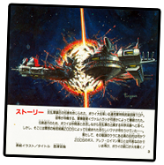

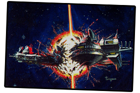
OLD vs. NEW: Clearly, not much has changed. Actually, the old design is more practical as a wallpaper because the left– & right–hand margins were darkened to improve the visibility of icons/images/etc.
TELL ME MORE: Needless to say, I dubbed this design the "Torigawa" Space Station in honor of the artist who painted it. But, I know nothing about him. Or her. If you have any information on Torigawa, please contact me.
This page is a WORK IN PROGRESS… ▲
For the most up-to-date information, please consult the Final Zone II Lyrics, Music & Artwork thread at pcenginefx.com. Thank you for visiting!


